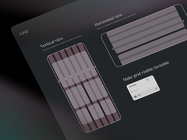
Grid System - Guidelines 3/4
Grid System
In our perspective the best grid system for mobile is:
6 columns
16px margin (apple standard)
Type: stretch
Gutter 16px
Based on our experience 6 columns perfectly cover the most advanced patterns on mobile.
Each distance is divided into 8px. However, the smallest space is also 2 or 4 px. To cover all spaces we use (almost everywhere) auto layout 💛
More by intent | IoT Agency View profile
Like

