Cul De Sac (iOS App) View Transition
Hey again,
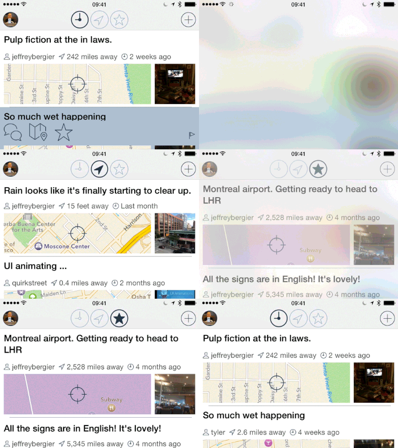
An older project. I was having an issue when switching between views. When the user switched from Date sorted to Location sorted to Favorites list, they have to wait for a network request. While waiting for the network request, I could either leave the old data in the table or clear the table out. Then when the request returned with new data, I could update the table. This was not a good experience.
I created a custom subclass of UIImageView that creates that creates an iOS7 style blur effect from a screenshot of the whole screen, fades it into view to cover everything up, then when the network request finishes, it fades out revealing the new data.
I think its pretty effective at letting the user that the action they took was received and then letting them know that all the underlying data has now changed because of their action. Which is key for a good user experience. Nothing is worse than when you tap a button and you don't know if you actually tapped it or not.
The GIF messes up the color. You can see the high quality video at this URL: http://jeffburg.com/zzNotPortfolio/dribbble/cul-de-sac-transition-video-trimmed.mov
