Login Form, Before & After

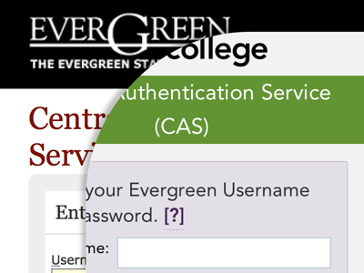
• Responsive.
• New, and newly-SVG, logo.
• On-brand color and typography.
• Mobile-first styling.
• Flexbox layout.
• Removed the pointless and terrible “clear form” button (not pictured).
• Not ugly.
Overall, p. dece.
(This could be better, but I don’t have access to the underlying HTML.)