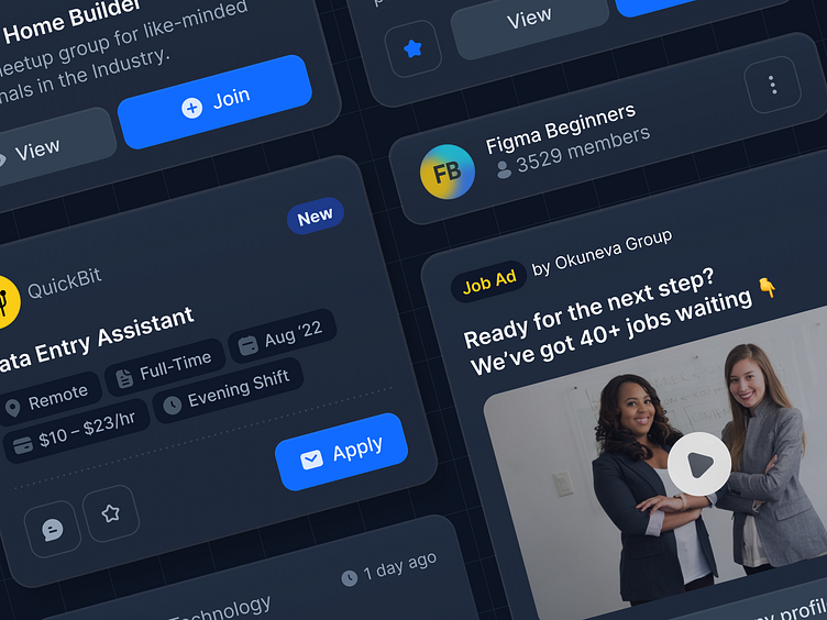
Community & Job Card – Dark Mode
Took my recent components for a spin 🎠
Been doing this for longer: I gave the components from my most recent shots a dark mode treatment. I tweaked them a little bit as well.
They function as group, community and job cards that could be used in an overview or search results page. They could show minimal or richer information.
Previous shots
Find the previous shots in light mode below 👇
Job Cards
This shot shows a few layouts for job cards that could be used in an overview or search results page. They could show minimal or richer information.
I've been exploring different layouts for UI elements lately and created a little custom library for that. No real use case in mind, it's more about tinkering with styles than actually using these components.
Is any information on these cards missing? What would you add or remove?
What do you think blue colored meta data? Too much color and irritating?
Content → Indeed.com
Icons → Feather
Images → Unsplash
Typeface → Inter
Feel free to leave your feedback, excited to hear your thoughts!
Stay happy, healthy and hydrated ☯️
Community Cards
This shot shows a few layouts for group and community cards that could be used in an overview or search results page. They could show minimal or richer information.
I've been exploring different layouts for UI elements lately and created a little custom library for that. No real use case in mind, it's more about tinkering with styles than actually using these components.
Is any information on these cards missing? What would you add or remove?
What do you think of using a heart icon for bookmarking? Could this be misleading?
What do you think of revealing all members on hover? Gimmicky or clutter?
Content → Meetup
Icons → Feather
Images → Unsplash
Typeface → Inter
Feel free to leave your feedback, excited to hear your thoughts!
Stay happy, healthy and hydrated ☯️


