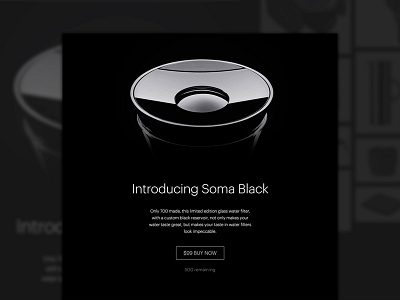
Soma Black
I designed the microsite for the limited edition Soma Black last November, which ended up selling out in less than 24 hours.
Each one purchased meant one person in Cambodia got access to clean drinking water through @charity: water . And, each Soma Black also came with a secret gift ranging from black socks to a black Eames Chair.
Before designing, I usually find a list of inspiration pieces to draw ideas from. Apparently there are very few ALL black websites out there. Apple's Mac Pro website was a big inspiration. I didn't realize until I started designing that things can get lost on all black sites very, very easily. Also, because of different monitors, various shades of gray can get lost, so high contrast is very important.
Having great product photography made all the difference here (in fact, the way the product was shot influenced the design of the site a lot).
Let me know if you have suggestions on how I could have made this better, or if you have any questions.
See it live here: www.drinksoma.com/black

