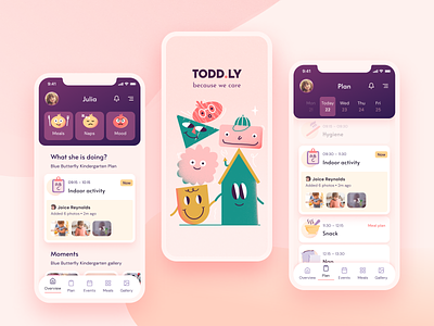
Todd.ly – edu-tech app concept
Hello everyone!
Today I’d like to share a concept of an EduTech app, which changes how kindergartens communicate with parents. :)
Going to kindergarten or nursery is very stressful - not only for toddlers, but also for young parents. They might feel anxious about how their child will adapt to new surroundings, with so many strangers around. Parents are often worried about their children's eating and sleeping habits, they are afraid of missing important life events, such as the first step or the first word. They might even feel guilty for leaving their child in an unfamiliar environment.
Todd.ly was designed to help them cope with the kindergarten reality in a healthy way. But how does it work? It’s not magic - believe me. With Todd.ly, parents are able to see their baby’s behaviour, visualized via cute emojis chosen by the teacher. This includes meals, naps, mood changes and more. In addition, parents can track the child's activity in a live schedule with notifications. To make the experience more interactive, teachers have the ability to add photos or videos in real time. They are automatically updated in the app - no more shared folders or hidden groups.
If you’d like to see more of Todd.ly give us some love <3
Idea, UX&UI: Paulina Łazorko
Huge thanks to Oskar Tomecki for amazing illustrations, Wojciech Tymicki, Monika Gulczyńska and Paweł Poterała for your advice and support :)
----
Thanks for watching! Let’s connect:
10clouds.com | Facebook | Twitter | Instagram | Behance
We’re available for new projects! Tell us more at hello@10clouds.com.
Would you like to join our design team?
Send your portfolio at careers@10clouds.com
