Colors - Guidelines 2/4
Colors
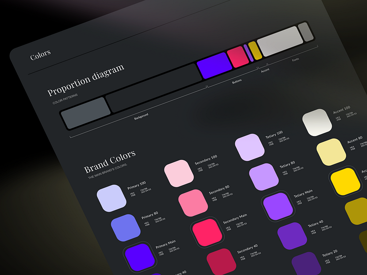
The Proportion Diagram helps us see the overall color structure of the app. It also helps when we prepare the dark and light mode.
In general, we define 4 categories for the color palette:
Brand colors (primary, secondary, tertiary, accent).
Font colors (headline, body, links, underlined text)
Background colors
System colors (error, info, alert, success)
More by intent | IoT Agency View profile
Like

