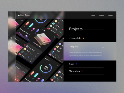
Minimalistic Designer Portfolio
This time I experiment with a simple 50-50 page layout with clear white borders for the navbar and sidebar. White text on black background gives maximum contrast😎. For font pairs I'm using Soleil/Didot.
Let me know what you think about this design🤝!
Projects page graphic - credits to https://www.figma.com/community/file/1114624124722652699.
Other photos from unsplash.
Go check out all the pages at my instagram post❤️! https://www.instagram.com/p/CgM9OeWJpa_/
More by Franky Hung View profile
Like
