Project Spiro Full Brand Identity
project spiro. Brand identity design 07/22
Heyo, cool people! Here is a new excellent brand identity released by me for an imagined graphic design agency called Project Spiro. Let's discuss it!
• Project spiro is a newly started graphic design agency that wants to rule the design industry. They believe they're much more professional and skilful to be that done. But it also needs to visualize their professionalism, and the best way for that is to design a brand identity for them.
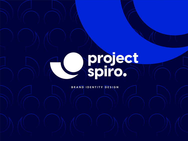
• As they believe they're professional at design, it would be nice if their brand identity also could represent a legendary thing in the design industry as a designer; the item first came to my mind is the mythical golden ratio spiral. And here is what I've symbolized in the logo icon, which represents professionalism and purity. It also symbolizes the name of the brand cause the name spiro came from the word spiral.
• Then I tried to make the typography generation friendly and professional also. To do that, I used a sans-serif font and provided it with a modern look, making the brand more professional.
•After all the blue colour is also used here for the same reason, to represent professionalism.
Here is that all, guys; I tried to create an easily rememberable modern and professional brand identity with everything. I thoroughly tried my best to keep the identity minimal, simple and same time, professional. I hope you have liked it!
• If you liked it and are looking for a brand identity for your company, then hit me at any of the contact links below.
Mail: mdimtiazbrs2007@gmail.com
WhatsApp: https://wa.me/+8801963851346
Other links: https://znap.link/mdimtiaz2007


