Vacancy Matching Platform - UI/UX Design
During the time that I worked at Create (a Dutch digital agency) I've had the pleasure of working on a new vacancy & job seeker matching tool. I had the role of UI/UX designer and worked in an agile development team consisting of front-end & backend developers and product managers. In this case study I will highlight some of the design choices I've made during the design process of this UI & UX.
Note: the development of this platform has been a team effort in which I had the role of UI/UX design lead.
Finding the right vacancies
One of the design challenges for this project was focussed on how we could help users find the right vacancies quickly and easily.
Process
I started off with UX research. The platform had three different users:
1. Students, who look for internships.
2. Jobseekers, who look for jobs.
3. Companies, who look for applicants and post vacancies.
I invited 6 of each type of user to do interviews with. I also made sure I spoke to users that were already using the platform, and to people who haven't used or seen the platform before.
The main goals were to identify what the users objectives and goals were and what they specifically think is important in their search for a vacancy or applicant. But I also wanted to observe how they used the platform features at that time and learn from that.
The interview methods I've used were:
1. Asking users to preform a task, where I would observe and learn.
2. Having a chat with a user, and digging deeper into their reasoning and thinking.
These interviews would typically take about 30 minutes.
What I then did was collect all the insights, map them out and create persona's, empathy maps and translate the insights into design challenges and user stories.
Design
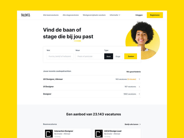
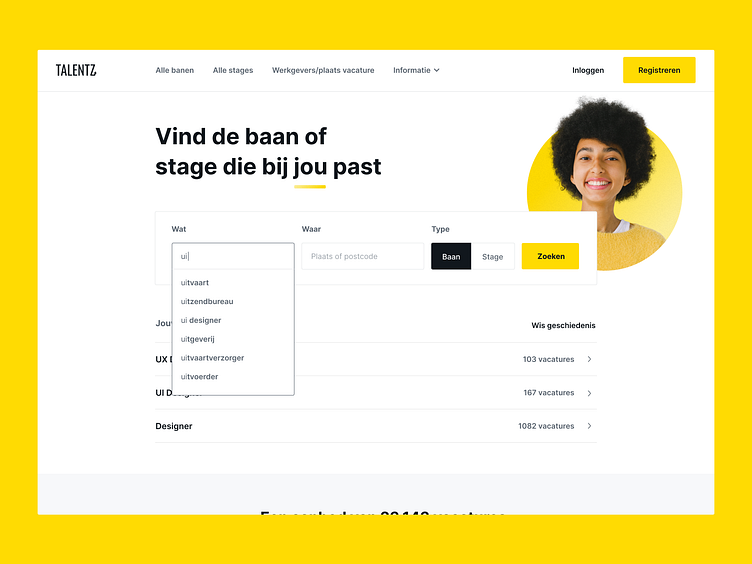
An important feature to begin with was a user friendly search engine. I added the design pattern that auto completes job titles. This way users could find their job title easier. I also added a search history that includes the amount of vacancies and highlights when there are new vacancies added.
In interviews with users I researched what properties of a vacancy were most important to them. Based on these results I included the job title, location and the choice between internship or job as the first search action.
It's important to keep the first step into the search flow simple, as you don't want to scare users away. In the next steps the user is able to filter their search based on secondary information.
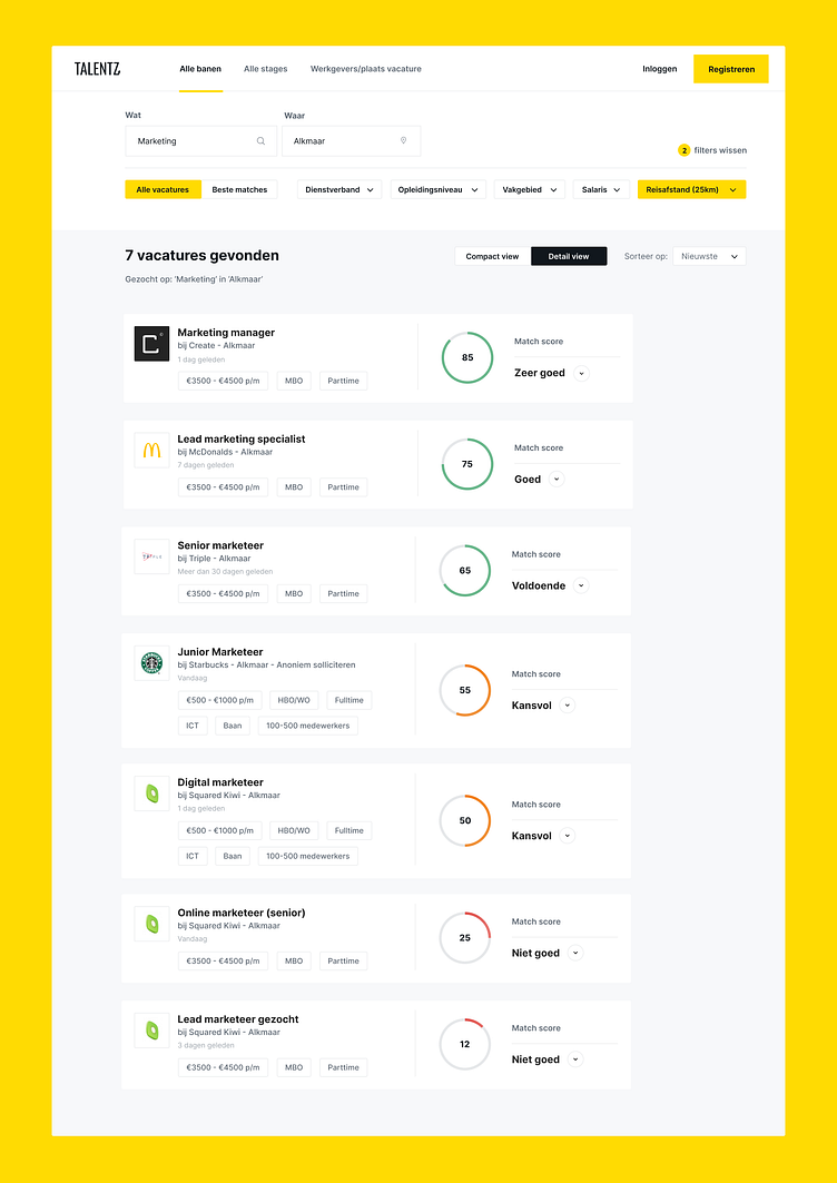
Search results, matching & filtering
When a user searches for a vacancy the tool will display the best results based on their search but also on what matches with their skills & competences. The users fills these skills & competences in on their profile.
In interviews I asked users to define primary and secondary vacancy information. With the results of this research the cards are filled with primary information based on what users find important in an overview. The detail page shows the user primary and also all the secondary information.
Next to the detail information, the vacancy card shows a match score. This score is based on how a user matches with the skills & competences of the vacancy.
After user tests, it turned out that users found it hard to determine what a 'good' match is based on a number or percentage. For this reason the match score includes labels and colours. Giving more sense of what the score means. These labels include a description after a click.
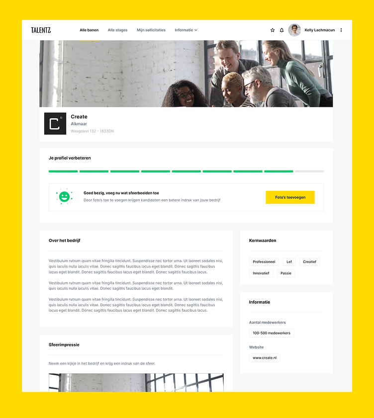
Profiles & matching data
During my research I found out that a part of the job seeker and student users had issues to determine what their competences and skills are. The concept of the platform relies on having both parties fill in data to create the matches with. This resulted in a very important design challenge: how can we help and support users to fill in their profiles so we can create a good match?
One of the important additions to the profile page is the progress bar where users see what they can improve on their profile and why this would help. It includes a button that goes straight to the specific form to make it easier and quicker to complete.
Match data
To solve the problem for the applicants I designed a feature that used an assessment from a third party to find out what a person their competences and skills are. They were able to add these automatically to their profile.
On the company side, this was on vacancy level. We also used data from a third party to connect competences and skills to a job title. The company would only have to select a correct job title, which proposed a list of competences and skills for that vacancy. It was still possible to add other ones to that list.