EGN: Main Page
Hi guys!
After a short pause coming back with the details of the EGN Networks case.
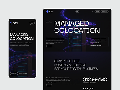
Today we want to tell you about the animations and interactions on the home page and the creative concept in general.
Just to remind, our client is elite data centers in California and Florida. Such a high-tech area also required a very modern website. In the concept, we wanted to capture a sense of the future and speed. We also had to somehow visualize the data, because when we talk about data centers we are talking not only about servers, but primarily about what is stored on them.
Data is too abstract a thing; it could be anything. So we showed it as abstract colored swirls that are flying around the servers. For this, we created a 3D model of the server rack and this awesome effect around for main banner. It's a looped animation.
To simplify the perception of the rest of the information, we decided not to overload the remaining screens of the home page graphics, but to work with typography and animation.
We hope you like the results as much as we do! Please, let us know about your thoughts in comments and press "L" to show your 🖤
In the next posts we will show you more about rebranding process and even more sick interactions. So stay tuned! 😉
___________________________
Team
Senior Designer: Denis Kondrashov
Junior Designer: Margaret Plotkina
Project Manager: Olga Krupps
Art Director and Graphic Designer: Maxim Berg
Made by Sick.
Follow us:
