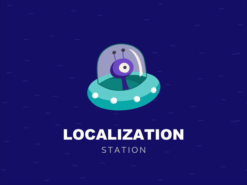
Logo design Concept "Localization Station Vol.2"


What's up, my friends?
We're fine. Today we've finished developing of the next version of the logo for "Localization Station". Now there are not two members in team but three already . After all , six hands is better than two :)
Attention to detail - is its essential part. And with the help of @YaroFlasher perseverance and professionalism, our purple guy cut the milky way by his spaceship. Thanks a lot. I do not know what I'd do without you :)
Press "L" to show some love!
Don’t forget to follow Zajno on social media and feel free to drop us a line:
Website | TheGrid | Twitter | Instagram | Medium