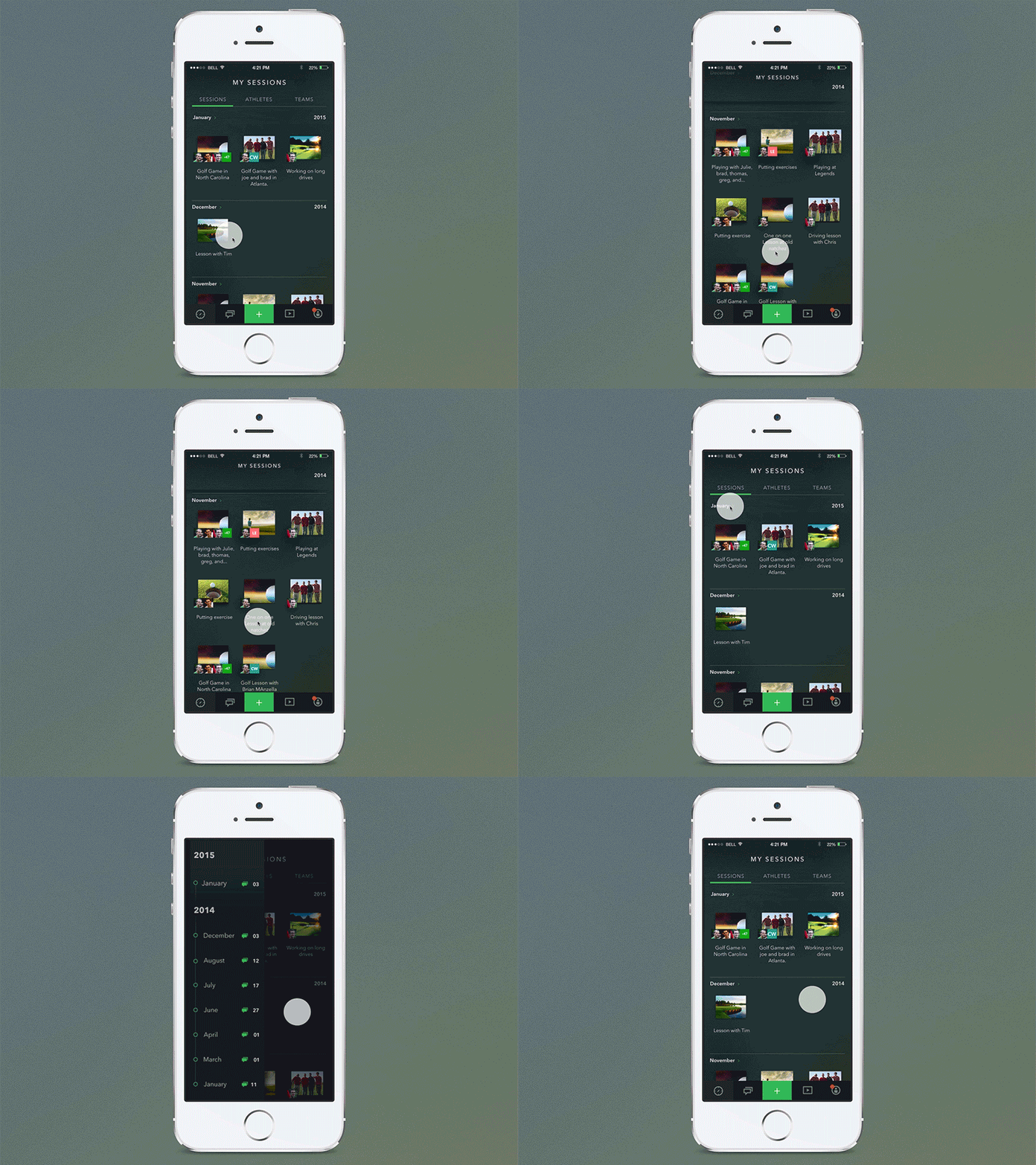
Session List Scroll
This is the 'session' section of an app I'm working on. Basically a place to store interactions, lessons, coaching, etc. We went from large images for the sessions to this new layout, with 3 to a row. Works better, but it lost a lot of its visual appeal. Since this is one of the main sections of the app, I wanted it to still look interesting. I went with a dark open background. Having no backgrounds for fixed titles, dates, and navigation, meant that a lot would have to be worked out with the scrolling. Otherwise, things will overlap and get sloppy. I dove into quartz composer to wrap my head around how this would all work out.
Pressing on a date slides open a timeline that lets you jump to any point in time that you have sessions.
More by Chris Whitsett View profile
Like
