Website Homepage Redesign for Bramework
🏀Hi, Creative Brains🏀
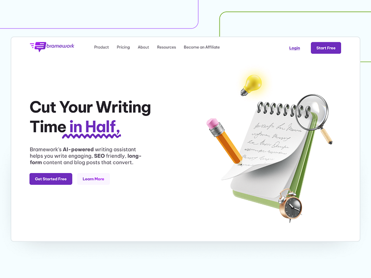
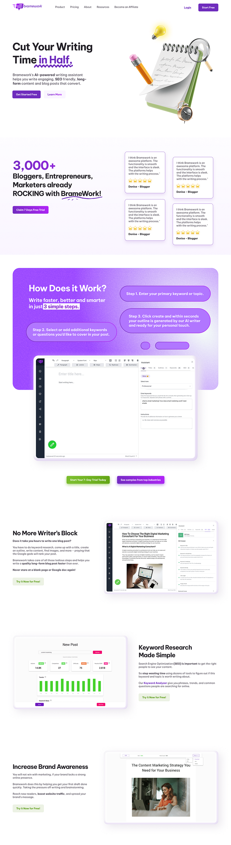
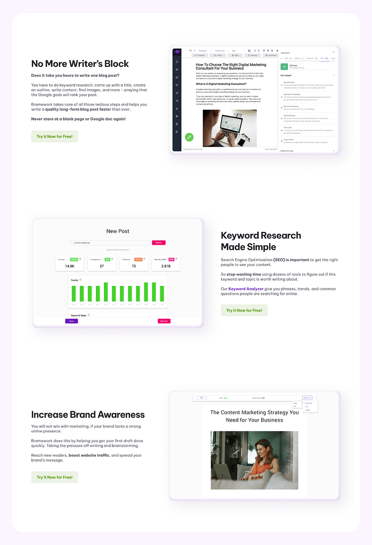
I have redesigned the homepage of the Bramework. It's a Self-assigned project that I have done for my portfolio.
I have noticed some critical problems in the current Landing Page design, so in my redesign of the Landing Page, I have tried to fix the issues.
I have Solved these problems in my redesign:
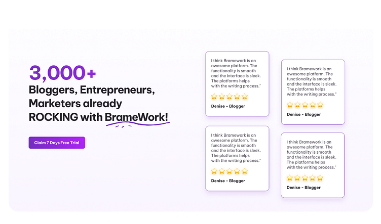
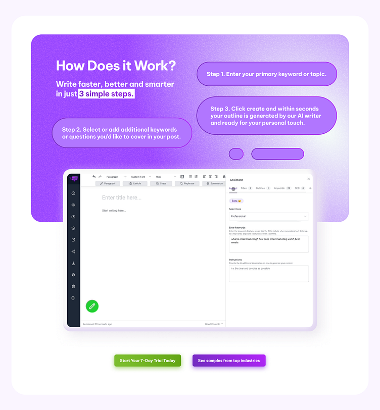
Branding Colors throughout the whole page
Choosing "Complimentary" color as a secondary (Except the Pink)
More Clean and Modern Font (From Google Fonts)
Left-Right Layout, for better readability
More Clear Visual Hierarchy (Both Colors and Typography)
Make the design after researching the competitors, and make your site stand out.
Proper White Space and Clear CTA's


☆:.。.o(≧▽≦)o.。.:☆
❤️ Press “L” to support the shot
😉 Currently Available for:
🔥 User Interface Design
✅ Branding Projects
✅ WordPress Website
✅ Motion Design - Icon, Startups, Landing, Logo
Want to Get started with your next big project?
Reach out to me here: hello@mubin.design
Website: Mubin.Design
Thank you for stopping by and for your time!
