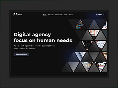
landing page design, Rubi
Hi Dribbblers! In this exploration, Luis and I were highlighted pieces of our design process, mixing glass effect with sharp shapes and black BG for a Swiss web agency, what do you think?
Don't forget to hit Like (L) if you liked it and share your thoughts on this exploration in the comments section.
Auivailable for new projects: royafarrokhzade@gmail.com
More by Roya Farrokhzadeh View profile
Like
