Project Pulse - Concept Design Rebound
Had a little free time today so I wanted to do a rebound of a start up that I think sounds promising. www.projectpulse.io
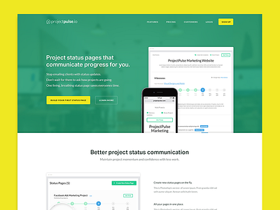
Wanted to do some changes from what the initial author made so I started with the Intro section.
- Moved the text on the left since I found more important to read what the app is all about then just show a picture.
- Darken the green and added a yellow color for more focus to the sign up button and “build your first….”
Features section
- The initial idea was to tell more about the most important features and also features that show how this web app can help but it would have taken to long to design so i made it as simple as possible.
Pricing section.
- Added “Annual billing” and small discount awareness.
- Made the Team plan pop up a little bit more then the rest
Testimonials Section
- Well… I can’t take to much credit on this, I found what Orman Clark did on http://www.themezilla.com/pricing/ to be a neat way of showing testimonials from clients.
And other things like making Title smaller, darker and bolder. Worked on spacing ...etc.
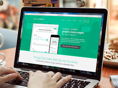
P.S I find the second version, of the Hero image, just darkened a little bit to be more suitable, what do you guys think?
Hope i didn't bored you.
Best.


