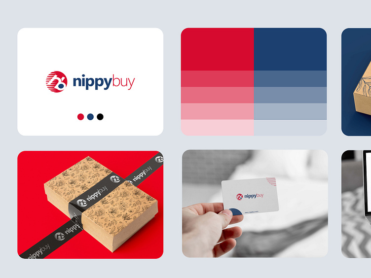
Nippybuy - Visual Identity
I'm happy to share with yo a brand identity i developed for Nippybuy, an online shopping store that sells high-quality gadgets and accessories.
To take advantage of the internet space, the brand wanted to build an online store to enable it to serve a wider customer base. The challenge was that, they don’t have any concrete identity; at least not one that is crafted with any thought behind it. My brief was to design a simple yet interesting identity for the brand. It should be easy to use on different digital platforms seeing that they are developing an online store and definitely going to be using different social media platforms. The identity should also be unique enough to stand out from the competition most especially when printed on products.
The overall look and feel of the brand are welcoming and exciting. Though using bright colors of red and blue, the shades of these colors make it calming and not shouty. To ensure consistency, the logo, colors, typography, and graphic element for the brand are used on all customer touchpoints; from the social media handles to the website and promotional flyers. It is also applied to all marketing collaterals and stationeries.
The new visual identity is underpinned by a brand style guide that we developed for Nippybuy’s marketing team, empowering them to confidentially use the identity in their communications to its full effect, without the daily support of an agency.
Read full case study of the project on Oniontabs' website for more.
My Agency - Oniontabs
We're a digital agency focused on helping businesses thrive through the power of strategy and design backed by modern technologies.
We design and develop brand identities, websites, apps and custom digital solutions for tech startups and service-based businesses so they can scale and acquire more customers.
Check us out at www.oniontabs.com
