Lettering help required PLEASE!
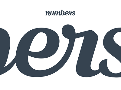
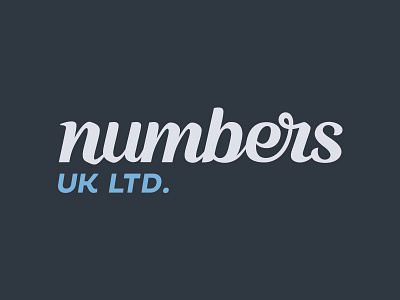
Ok – this logo was kind of finished a long time ago but the er join has bothered me ever since. At large size it looks fine – I'm really happy with it (although not perfect). But when reduced down small it really reveals a lack of balance and I'm desperate to try and fix it if I can.
Any lettering heroes that have a few moments to point out what is probably blindingly obvious, I'd really really appreciate it please.
More by Owen Jones View profile
Like

