Landing Page | Minimalism
Hey guys✌🏼
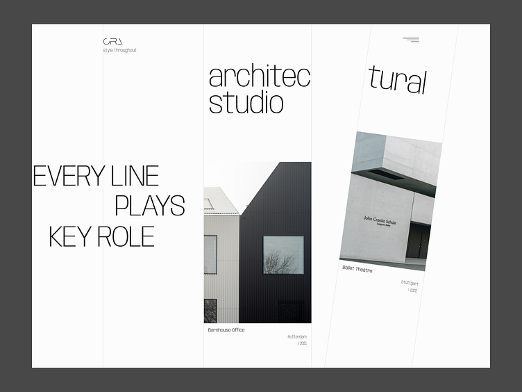
Here is my new landing page design for an architectural studio. The main idea is to create design in minimalist style among the white and free space, but with the kind of accent☝🏼
In this case, I used lines to interest the user. In addition, the lines serve as guides to help the user make their way to the end of the page.
By the way, the title simultaneously reflects the idea of the studio and my design vision.
How do you like it?
Share your thoughts in the comments😉
▪️ ▪️ ▪️
Looking for a creative and trendy design? I would love to hear from you👇🏼
Email me: info@ux-mind.pro
More by UX MIND ™ Design Team View profile
Like
