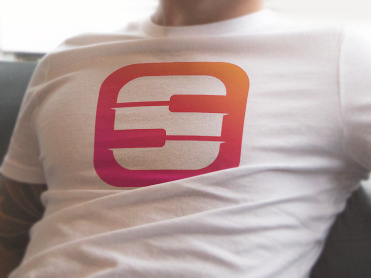
Piano + S letter icon
Hi guys!
The logo idea has several symbolic meanings - piano keys and “S” letter.
Style - minimalism with hidden symbolic meanings. Color palette is constructed of warm pastel reddish shades which gradually change each other. Palette compliments project’s creative strategy - the blend of all communication needs.
Must mention, logo was done more than half a year but was rejected by company which name we can not disclose.
Check out other design projects done by TIE A TIE in portfolio: Branding Design Agency