Cornerstone Website
Hello Dribbblers,
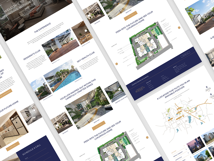
Presenting the designs of the Cornerstone website. I've kept the overall design very minimal and tried to make it clean by using white space. Have used colors like Blue and Gold to bring out the luxury element.
The Home Page
The Location Page
Mobile responsive design
Thanks for scrolling. Do let me know your feedbacks :)
More by Shilpa Shree MV View profile
Like


