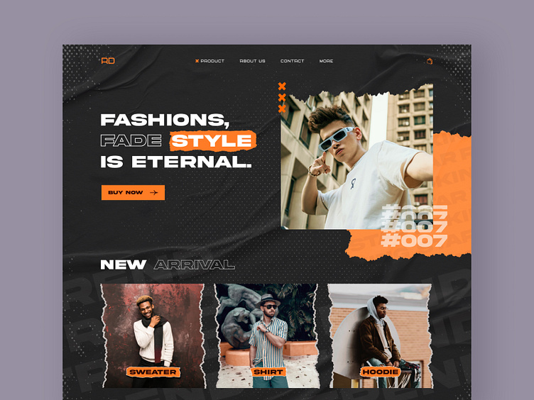
eCommerce Clothing Fashion header UI UX Design by Urban Style
Hi Dribbblers! 🏀
Here is the Explanation of the Design 😇
-------------
🤩 Design theme: Urban Style eCommerce header.
😍 Logo: Top left because users are used to seeing a logo on that corner, as a designer I can't make them confused by introducing a new logo position.
💀 Web Navbar: Shows active page by using brand color, applied the visibility of system status of heuristics evolution.
😎 Cart: According to the Z pattern it's in second priority so that users can be informed how many products are in the cart, business goal is applied here.
🤐 USP: According to Z Pattern we kept the USP first position so that users read it first.
😵 Button: Button contrast 7.16 which is a very good result according to coolors.co website.
🥳 New arrival: this is the section that attracts users to discover new products
-------------
💬 Feel free to add your thinking in the comment section
Have a good project? Let us know ✅
📪 Email: Message here
😍 UI Kit: Gumroad
Check out our agency design :

