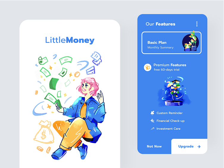
Upgrading Screen for Financial App
Hi, this weekend I did explorations with pastel colors and Impressionist brushes. I would like to see this kind of style in a more serious industry like finance or management apps to bring casual and fun tones to the product.
I use plants as a metaphor to explain the features mentioned on the upgrading screen. What do you think about it?
I also did other playful explorations with other ornaments, for example with these cute polaroids:
___________________________________________________________________________
📩 Work With Us: business@indev.id
Services we provide:
• User Interface Design
• UX Research and UX Design
• Website & Mobile Design
• Web Development
• Mobile App Development (iOS/Android)
More by Indev View profile
Like


