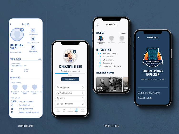
Historik App - Profile Evolution
When designing a product, the final design often evolves as you do more research and receive more qualitative data. Notice how the wireframe evolved into several screens to provide a better user experience.
Learn more about the Historik project at: https://www.crooz.media/historik
Conceptual sketching
The profile screen began with pen and paper, breaking down the core features. It helped to remove any barrier that colors and images might introduce.
Research, iterate, and improve
Once your idea makes it to a digital canvas, it can reveal features you may not have seen with traditional mediums. In this case, the ideas were linear. I wanted to explore what we could potentially pack into a profile that we had not previously considered, like bookmarks.
Refine and explore
One of the ideas that I wanted to explore was using a swipeable tab layout so the profile screen could be added to at any time. I wanted to add some contrast with color blocking and introduce design system elements to see it come together.
Qualitative data and feedback
After taking feedback from potential users in my community and iterating with my development team, we decided the tab feature may not be the best course of action. The end result was a paged layout that allows each part of the profile screen to be broken into sections. This still allowed for two of the primary goals. Scaling the profile screen over time and creating an easy-to-use interface.


