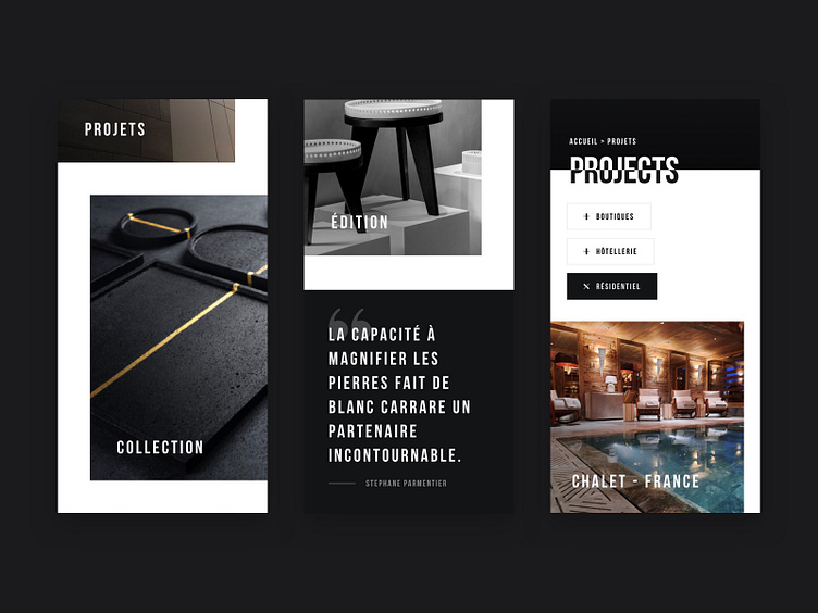
Blanc Carrare - Mobile Layout
The whole idea of the art direction was to keep it very raw, with cutting edges and split effects on the typography.
On mobile, we still wanted to have that feeling, even if the grid is usually more monotone. Bringing that unstructured feeling, that differentiates the design.
Role : Art direction / Webdesign
Agency : Adipso
Date : 2021
More by Mikael Buch View profile
Like
