Medme
MedMe helps pharmacies deliver their clinical services at scale starting with scheduling, documentation, virtual care, and follow-ups.
Our job was to build a brand that is scalable and future-proof and creating a website that helps patients understand the products and services MedMe offers
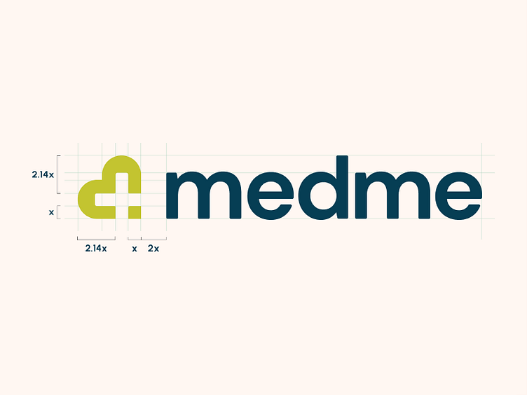
Logo
The medme logo represents us at the highest level and is vitally important to our brand. It is the universal signal for medme across all communications. It establishes our brand and visually anchors all of our materials.
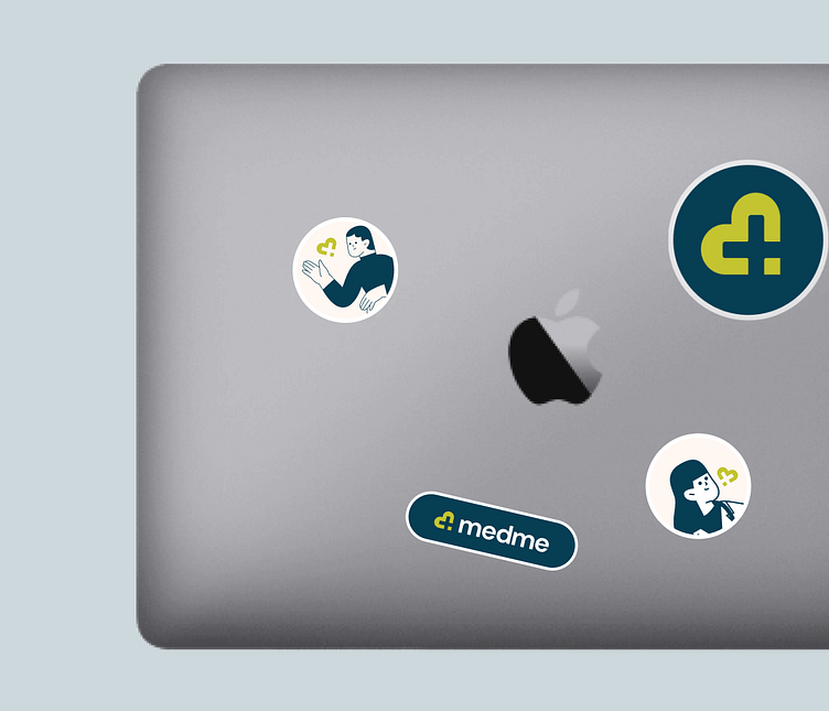
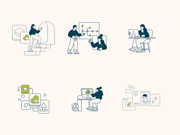
Illustrations
We wanted to create a unique and fun set of illustrations that they’re simple, elegant, and easy to understand
Iconography
For our icons, we really wanted to keep them simple, nothing too complicated. We use two of our main colors to keep everything on brand.

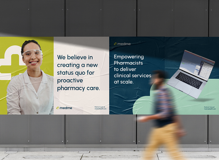
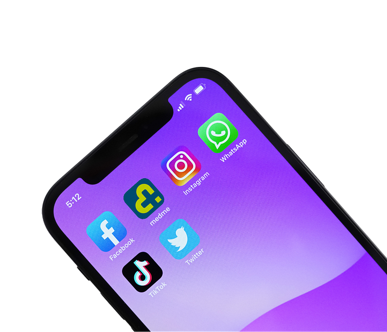
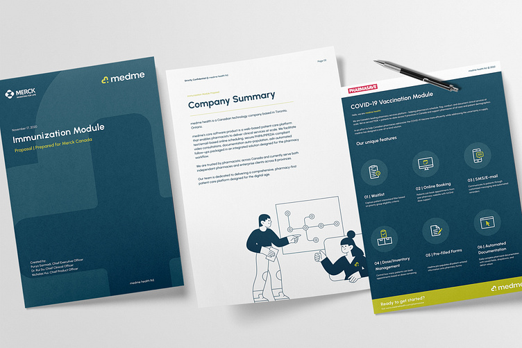
Marketing Assets
Just to keep everything together we built numerous of template samples of how their social media should look. So in the future, this can be easily scaled.
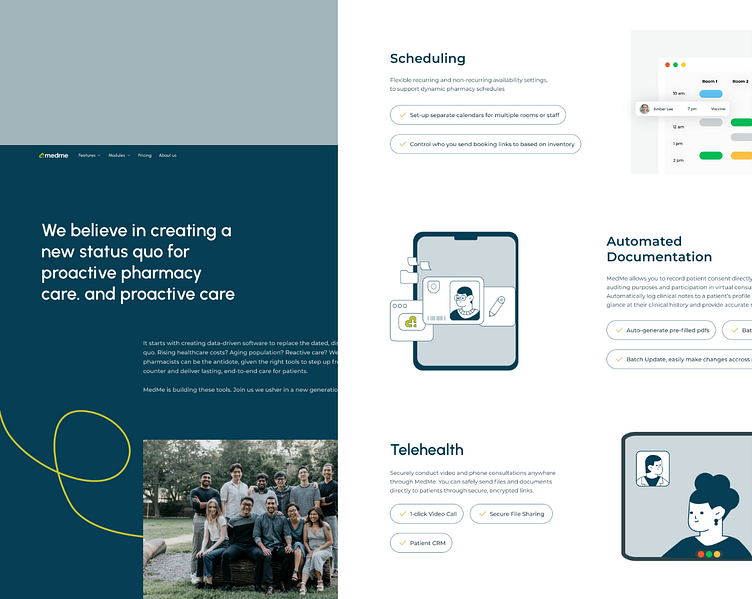
Website
For the website we focus on building something that goes in line with the branding we created, we also wanted to make sure the content was easy to understand without losing the terminology of the medical practice.
We also wanted the website to be a fort to recruit new employees, showcasing the fun and engaging environment medme offers.