Typography | Personal visual identity (rebranding)
For my visual identity, I've chosen two typefaces:
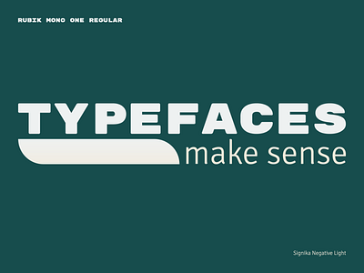
• Rubik Mono One Regular
• Signika Negative Light
Rubik Mono One Regular uses only for headers, and Signika Negative Light is for a text body.
If you notice, these typefaces are both sans serif, but I made emphasis on another thing. These typefaces have structural differences. Rubik Mono One is a monospaced bold typeface that has rounded corners. On another side, Signika Negative Light is an excellently readable typeface with gentle characters. Add to these features the lack of lowercase in Rubik Mono One, and this group of typefaces creates a beautiful typefaces structure contrast.
Do not hesitate to drop your opinion on my solution.
_____
For brand identity inquiries:
T: +380930792808