BOOLAT
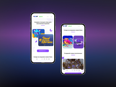
Specialists of our company Promodex have developed the BOOLAT website, which represents a company specializing in the development of mobile games. The design of the page is made in dark colors. Does not distract the user's attention from the selection and purchase of goods. We took into account the main rules for placing elements on the page, but still preferred the hints of intuition. Being engaged in the development of design and the location of important components on the pages, we always put ourselves in the place of the user. After all, it often happens that the views of the site owner and developers may not coincide. The golden rule in this situation is to imagine that we ourselves use the resource and in what places it would be convenient to see certain elements.
Behance: https://www.behance.net/gallery/148128003/BOOLAT
Thanks for watching! Subscribe to me and like my works! This motivates me to design creatively!
