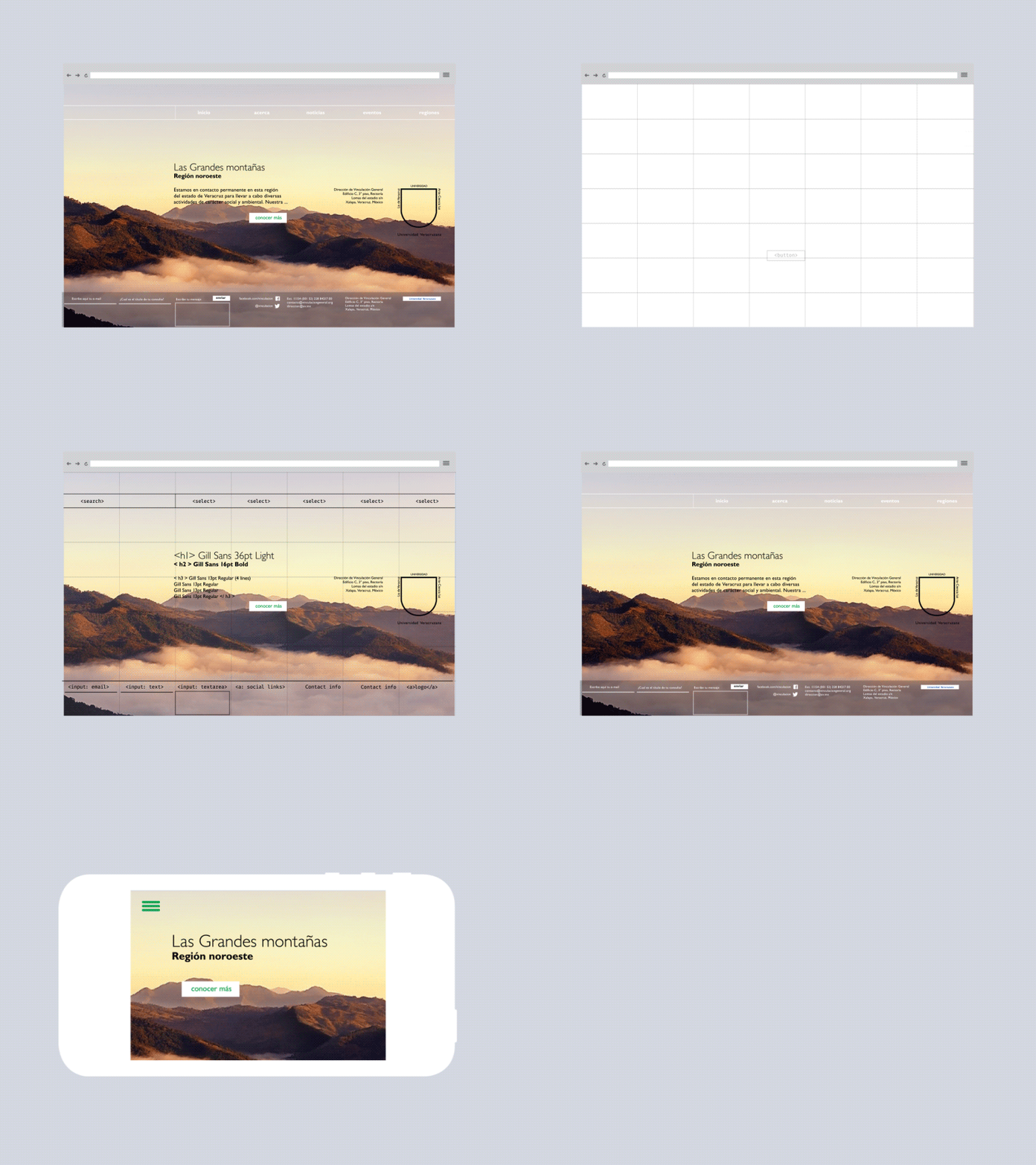
website grid
Helllo! This is a visualization I made for for a social institution microsite. It is intended to be simple, manageable and prioritize content.I always start with a grid; even if I don't follow it after, it gives me a good grip to start an interface (don't forget to check the @2x).
(you can check the working wireframe in here http://cesar-gomez.com/clients/DVG/ ) ☺
More by Cesar Gomez View profile
Like
