GRUNGE IN ALL ITS GLORY 2
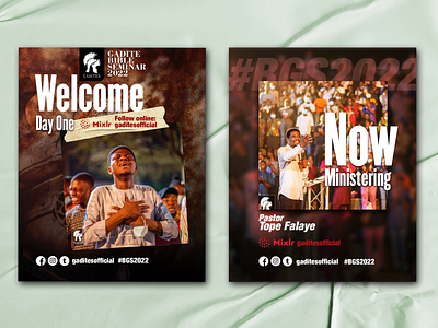
A continuation from my previous post. An important design principle is Consistency. To keep consistency with the first post which was the main DP, all other designs in the project had to follow the same theme: Highly saturated hues of red, lots of grunge and grain and heavy vignettes.
A medieval helmet can still be seen in the background to preserve the original theme of War and Victory.
More by Akanji Benedict View profile
Like
