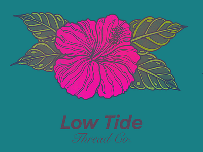
Gritty Hibiscus
As part of a proposal for a clothing and lifestyle company, I chose to use a hibiscus (to tie in with a nautical theme) combined with a clean sans serif font contrasted by a cursive font, to represent the bold, yet classy element of the brand.
To tie it all together, I gave the whole piece a washed out gritty look to add to the mystique of the company’s brand.
More by CKJVDESIGN (Chris Farr) View profile
Like
