Bottom sheet table views
One of the most common challenges in SaaS context is the real estate - there's so much stuff to accommodate and ideally, served in an easy to digest form that helps the user analyze the data and act accordingly.
We know that for some users seeing 'Reply' and 'Reason' right away will be very important. Horizontal scroll is always an option, but we knew that would, to extend, compromise how users interact with the platform in order to get the job done.
The alternative solution was to go with 'card-like' tables, where you get more flexibility with how much data you can fit in, but it gets more expensive in terms of height + those card-tables are more difficult to scan.
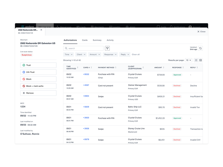
The alternative solution was to go with 'card-like' tables, where you get more flexibility with how much data you can fit in, but it gets more expensive in terms of height + those card-tables are more difficult to scan.
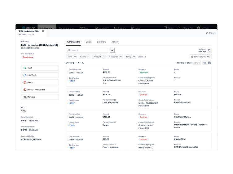
Instead of choosing between the two, we offered the 'toggle' on the table view and let the user decide what works best for them.
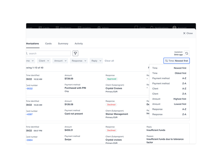
Apart from more messy layout, the sorting was not really there since the table headings were gone. We decided to include a selection, but since we already use selections for filtering, sorting got it's own location, and slightly altered visuals...
This was the first instance where we encountered real estate issue to the point where we got back to the drawing board and questioned the 'current state'. In a long run, the toggled table view will be offered throughout the platform,
Feedback, especially negative, always welcome!