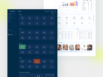
Summary Page Dashboard 2.0 🐳🐳🐳
Hey guys!
I'm back with the summary dashboard desktop design concept for Triple Whale. Feautuing a simplistic, minimal design, the dash is meant to convey a feeling of clarity of the (many!) data points being displayed. A new feature of this design consists of customizable widgets, which aggregate some of the top metrics and features of our amazing products, like the Creative Cockpit, Triple Pixel, and more! The ability to change between dark and light mode is a new feature of the summary page meant to give users the ability to further customize their experience with Triple Whale 🐳.
😊 Hope you all enjoy!
More by Ewelina Adamczak View profile
Like
