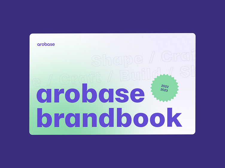
Brandbook arobase
Hi there! Take a fresh drink and scroll down…
We are pleased to share with you some extracts of the work we do as a team. Let’s go back to basics with what we started with: the arobase brandbook!
🧩 The goal was to create a comprehensive brand identity for our studio, to form a coherent whole with our core values in a recognizable way. We are strong believers that branding is not just a visual identity, it is also about feelings and emotions.
🧬 As we process for all projects, we started by exploring the DNA of the studio to extract core guidelines to follow. The team then worked in an agile way, trying and adapting the right ingredients to end up with the perfect match!
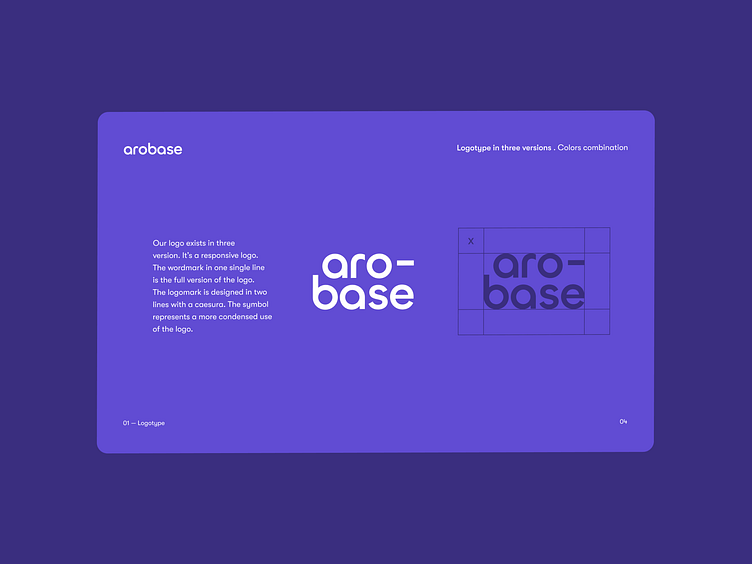
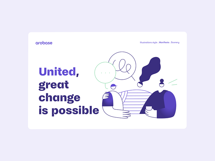
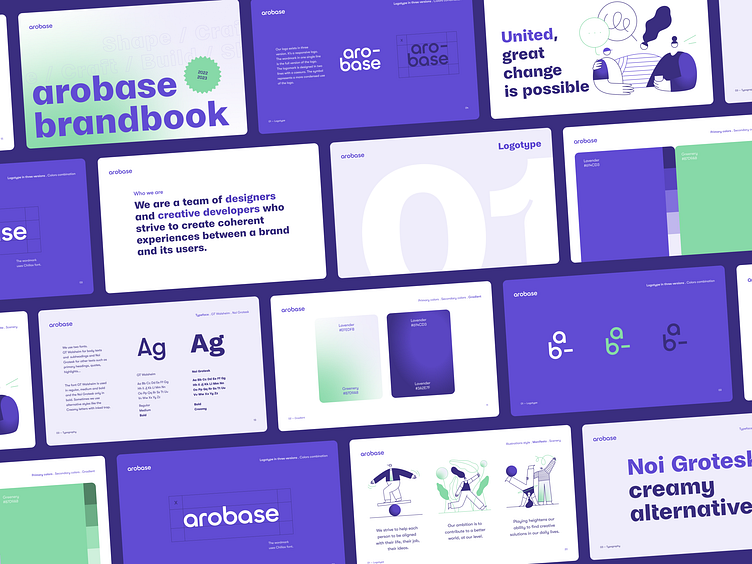
🎨 We developped a gradient color scheme mixing greenery to lavender to vehicle vibrant and digital impressions. Colors work in combinaison with an illustration system composed of living shapes and human representations to convey warm and playful feelings.
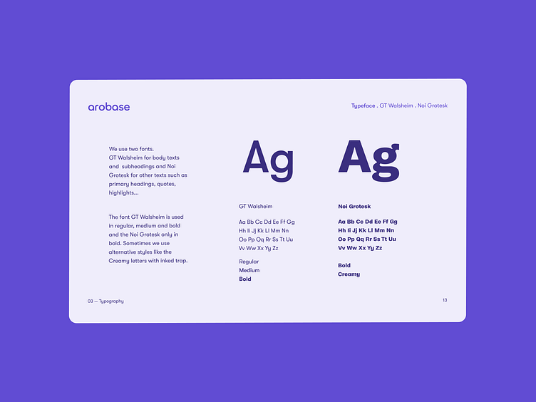
🖍 Typography is again the result of the right mix between a friendly but precise font, GT Walsheim, and an illustrative font with a stronger personality, Noi Grotesk.
We hope you like this brandbook as much as we do 🤘