Network Analytics Dashboard
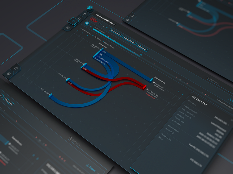
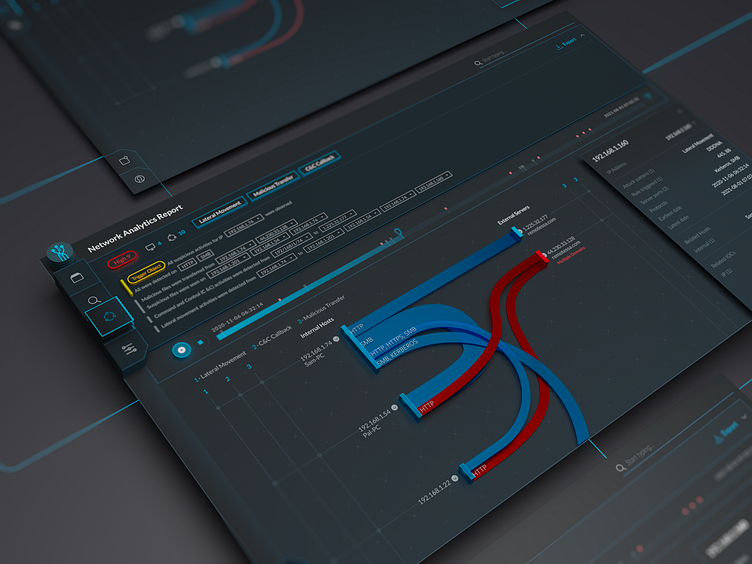
The UI design and familiar tool icons created by Fuselab Creative have intuitive navigation for users that needs no explanation or training. Accessible interactive elements catch visitors' eye and we managed to emphasize the part that encourages the use of the product and network analytics dashboard. We are proud that we had a chance to improve the user experience. The UI dashboard design is fully responsive, allowing users to access information from any device. Services we provided
— UX research
— Product research
— Product design
— Design System build
Follow us and stay tuned.