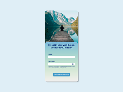
Daily UI 001 - Sign Up
A mobile sign up screen for a hypothetical wellness workshop. Best practices around sign up screens were implemented, including limiting the number of fields, providing clear instructions for fields, and ensuring the CTA button stands out and has action-oriented copy.
More by Amanie Johnson View profile
Like
