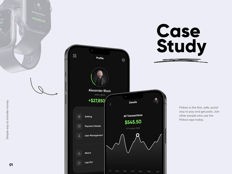
Financial App - A Case Study
Discover the insights you need to make the most of your money. Start with the big picture and see all your financial accounts on one screen.
Overview
Track your money and credit together, and the app will help you plan for what’s next.
Design Process
A wireframe is generally a monochromatic drawing created in the design phase of the Design Thinking Process. It provides a blueprint of the page structure, layout, information, and functions. This gives stakeholders a clear idea about the functioning and visual representation of the application UI.
Minimalistic
The minimalist mobile app design has lots of white space and few elements on each screen. This means users aren’t overwhelmed by heavy elements and a knotty navigation system. And as users interact with fewer elements in minimalist apps, they have fewer chances of finding wrong navigation paths and getting confused. In our app, we try to use this design method and hope all of you like it.
Monitor and build your credit
- Access your credit score and credit report any time
- Get score change notifications
- Understand the factors that affect your score
- Learn ways to keep building – increasing your credit utilization or paying your bills earlier and more.
Apple Watch
Set a spending target and track it on the go. Quickly check your status by day, week, month, or year. Access your spending simply by checking the date.
User Flow
In this guide, we'll bring some clarity to the complex world of user flows and share a clear step-by-step guide on how to create them.
Design Style
Our research shows that the best organizations use a design system to streamline and scale experience design (XD). You can see the Font and Color section of the design system in this showcase.
Finished!
❤️ Press "L" if you like it.
We are ready to create something wonderful for you!
📧 Drop us a line: info@unwarp.studio


