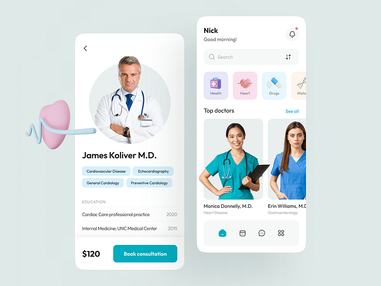
Healthcare Mobile App concept
💌 Have a project idea? We are available for new projects! info@ronasit.com | Telegram | WhatsApp | Facebook | Linkedin | Website
The number of mobile healthcare apps was over 300 thousand in 2019 and during the pandemic, it certainly became only bigger. This means the demand for new medical software only rises. That's why today we’d like to share with you our new concept of a healthcare app.
The home screen displays a search bar with filters and a list of top doctors. The second screen displays the doctor’s photo, information about his or her areas of expertise and education, the price of appointments, and a CTA button.
This concept was designed with the use of a pastel and airy color palette. The main UI elements are accented with vivid blue. The bluish color palette can be associated with healthcare.
The clean UI and minimalistic interface will make the in-app experience smooth and pleasant. This design lacks visual noise and doesn’t distract users from their main goal – making appointments with doctors.


