Hey PB&J About Page
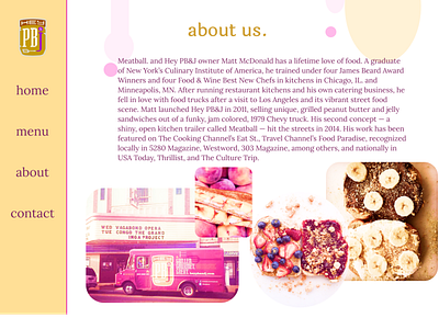
I decided to redesign Hey PB&J's website recently. This is the third post and shows their about us page. I wanted to further the feeling of fun and flavor, so I used some kind of drip shapes at the top, almost like peanut butter and jelly dripping off the bread. I also decided to add some more images from the company's Facebook page. I edited them again, like I did on the home page, to be in the purple and golden color scheme. I think that the white background on this page (as opposed to the light yellow and pink on the other pages) makes it stand out and really show who the company is. The original about page for Hey PB&J can be found here:
More by Jordan View profile
Like
