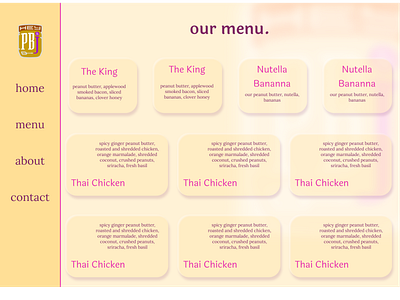
Hey PB&J Menu
I decided to redesign a local foodtruck's, Hey PB&J's, website using Figma. This is the second post in the redesign. This page is the company's menu page (I didn't fill out all of the cards). I wasn't sure what I wanted to do with the menu design for a long time, but I landed on this kind of soft ui look with the main golden yellow color. I decided to give the page a little more texture by adding a really blurred out version of the company's logo in the background. I think this helps show depth in the site, and indicate that the cards are actually semi-transparent. I like the smooth appearance of this page because it alludes to the feeling of peanut butter. I do think that the layout could use a little work, though. What do you think? I couldn't decide if I liked the smaller or larger cards, so I just included both in the design. The link to Hey PB&J's original menu page is:
