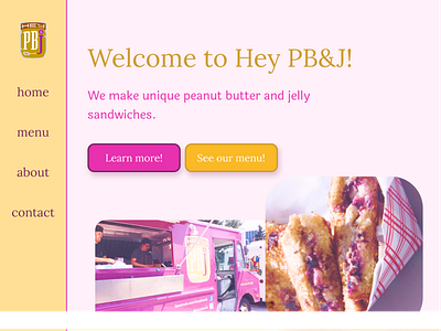
Hey PB&J Home Page Redesign
This is a redesign of Hey PB&J's home page. Hey PB&J is a peanut butter and jelly food truck local to my area. They create really unique and flavorful sandwhiches, so I thought their website should be really colorful and fun. I based the color scheme off of their logo, which you can see in the navbar. It is essentially peanut butter and jelly colors with a golden yellow and warm purple. The images came from the original site itself or from the company's Facebook page. I tried to edit them to be in a similar color scheme to the rest of the site. I also decided to use two contrasting fonts, Laila and Lora, but they are both kind of bouncy and fun. Finally, I decided to round the corners on all of the images because it reminded me of the way bread has slightly rounded corners, and it furthered the whimsical feeling I was going for. The link to the original website is:
