Namesake Brand Illustration
My primary challenge for this brand was to create a unique visual identity with a strong presence that would stand out and be memorable in the competitive industry of craft coffee.
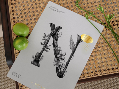
Inspired by nature, living intentionally, and founder Michael Bean's background in horticulture, we designed the brand to reflect their primary value, growth.
This custom illustration reflects this, and is used throughout the brand's collateral as a recognizable brand mark. The 'N' shape is based on the logo's letterforms, and the plants represented in the illustration were intentionally chosen to reflect the story of Namesake founders, the Beans family, whom the brand is centered around.
