Namesake Coffee Logotype
My primary challenge for this brand was to create a unique visual identity with a strong presence that would stand out and be memorable in the competitive industry of craft coffee.
This visual identity is inspired by the founder's passion for nature – their knowledge of horticulture and coffee farming practices, and the natural flavors found in their roasts.
Designed to reflect the brand's primary value, growth, I combined a color palette that evokes feelings of growth and new possibilities with custom illustrations, natural textures and compostable materials for the coffee packaging, bringing the brand to life.
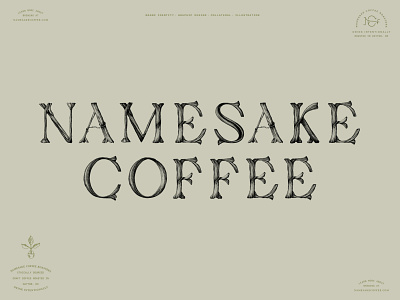
Keeping to this visual theme, the primary logo reflects a natural theme through letterforms that appear to be branches growing in all directions. Through the use of uppercase typography and a detailed approach to the artwork, this logotype reflects the quality of their product, giving it an overall elevated appearance.
