Hutch Interior Design App Branding / Logotype Symbol Design
Background
Hutch Interior Design App is worlds leading interior design platform under one roof. Just take a photo of your room and decorate in just a seconds. Focusing on style and home Hutch aims to solve the problem of home decoration in a simple way.
Approach
Hutch logotype is constructed in such a way that works as a standalone logotype yet as an icon. A system that can be expended without loosing it's identity and purpose. The goal was to bring home and style in a simple, timeless and memorable way. The simple vibrant wordmark creates a distinctive look.
Wordmark angles creates a sense of roof and home while negative space "arches" dwells of door opening and creates welcoming experience.here...
Identity System Exploration
Updating existing Hutch Interior Design App identity was important to see that we are not designing just a standalone logotype, but a system that can expand on various channels.
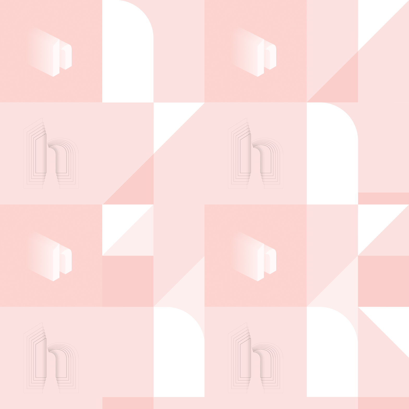
We aimed to connect analog world to 3 dimensional environment. Inspired by the architecture and lifestyle our system was designed from geometric shapes and layers. Shapes form an abstract yet relatable context of styles. Like a house tiles, witch every system it's unique to it's own pattern.
Is important to reflect versatility in a singularity. Creating such a system we developed an identity that everyone can relate to the style they are seeking. This is what Hutch App offers.
Symbol / Mark / App Icon
Symbol mark was designed with intention to go along with logotype word-mark. We closed a gap between people and homes. Symbol features roof like angle and arch door opening creates a distinctive and compelling feeling of being open for change when it comes to your home and interior design.


