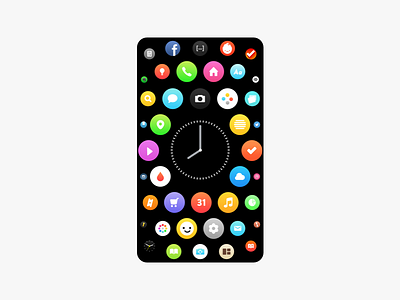
Fluid Grid
Inspired by Watch interface. The fluid grid would make one hand use of larger phones much easier, while displaying more apps than the current grid design used on mobile devices. On desktop sized devices this would become a circular menu a corner.
See the higher resolution image attached.
More by Josh Ackerman View profile
Like

