Tweetbot 3 – Apple Watch Concept
Hey y'all!
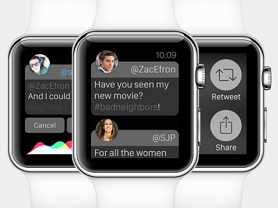
I just did a quick concept for Tweetbot 3 on the Apple Watch. For me it was important that the moral behind the UX is "less is more" because on a Watch you really just want to see quick information and maybe interact just a tiny bit. The Design is a mixture of Watch OS and Tweetbots own Design Language.
In the middle you can see the Timeline of Tweetbot which I reduced to a minimal of what the iOS App shows. If you force touch on a tweet you get the menu where you can reply, retweet, favorite or share. If you choose to reply you get into the screen on the left where you can tweet by using your voice and Siri.
I hope you like it and feedback would be welcome as always!
More by Sebastian Metel View profile
Like
