Illustrations for UI (Email/SMS Marketing Website)
About The Client And Their Problem
The Client, https://savio.agency, is an advertising/marketing agency. They create conversations that sell for e-Commerce stores.
When they contacted me, the UI was more or less finished but lacked personality and visual elements that would help the users navigate their website and have a pleasant experience.
They knew illustrations would solve this problem but didn't know what kind and what would go well for each section.
The Solution: KEYWORDS
The main issue was not just the empty UI space; the client also needed help knowing what they wanted to solve the problem.
Then I suggested an idea that worked with many clients: using KEYWORDS.
I told them to give me a list of keywords that would best describe what visuals they wanted to convey: one word for each illustration.
Afterward, they would need to sit back and relax because I will come up with the best illustration that portrays that keyword.
Next Steps And My Work Process
As always, my process is divided into four parts:
1. The Communication Part: I discuss with the customer the brief and details about their branding and identity, and I do my research. This is the part where we also discuss the "keywords" in case the client is unsure what they need.
2. The Written Description: After I have the Keywords, I offer a Written Description of what I will create. I send the customer the text for review before I get to do the Sketches.
3. The Sketches are done according to the written description, and I also offer a color palette that goes well with the branding in case the customer doesn't have one yet. After the sketches are done, I send them to the client for review.
4. The coloring: this is where the magic happens. Once the client agrees on the sketches, I color/vectorize/polish the drawings.
In this case, the customer wanted colorful illustrations that would stand out.
The Hero Illustration
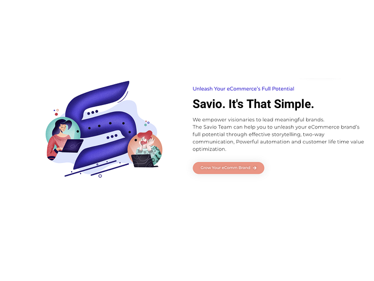
The first illustration that the client wanted was related to what they do: marketing for messaging and email. The keyword they provided here was "communication," but they wanted to have also something of their Logo incorporated somewhere (The S from "Savio").
Therefore, I came up with the idea of having two characters on their laptop. They would be placed on a speech bubble, and the Logo (the "S") would appear as a text communication channel between them. This would perfectly convey the Logo, the SMS/email service, and the "communication" keyword.
Migration and Email Marketing
The second keyword was "Migration" (referring to the migration of clients to the email marketing system they offer, starting with Klaviyo).
I pitched the idea of butterflies flocking the Klaviyo logo while leaving a typewriter behind. Why butterflies, and why Typewriter? I was thinking; maybe it's too feminine? But nope, it was not. The client loved the idea after explaining the subtle meaning of those symbols.
The Butterflies are courageous and figures of massive migrations- the most successful clients, in this case, would be like those brave butterflies who choose this service.
Old Typewriter symbolizes the old email marketing system the clients are migrating from (basically any other rival companies).
"Reviews"
Another service that the client wanted to convey is the power of leaving reviews through email marketing. For this section, I opted out of a visual depicting a hand and a single "click" that would "catapult" 5-star reviews through a canon.
Using unexpected symbols to divulge an action (powerful canon firing reviews in one click) seems to impact the user immediately.
"Loyalty"
I used the most beautiful story related to loyalty for this keyword: Hachiko's story. The story goes back to the beginning of the 20th century and is about Hachikō, a Japanese dog that waited for his owner to return from work every day at the train station.
One day the owner didn't come back because he died while at work, but the dog continued to wait for over nine years for his beloved owner.
Of course, not all users would know the story of this illustration, but a dog would always symbolize loyalty. I think storytelling it's the most powerful tool of marketing...who knows, maybe one day the client can even use this story accompanied with the illustration.
Email Design
The illustration for Email Design went relatively fast and easy: I thought of a papyrus (again an old symbol depicting writing and email in modern times) being polished and brushed up by a few hands (like makeup artists do it on model faces) mixed with some UI elements.
Public Link
All the illustrations were used mainly on the Website here https://savio.agency but also in Email Marketing campaigns.


