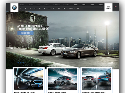
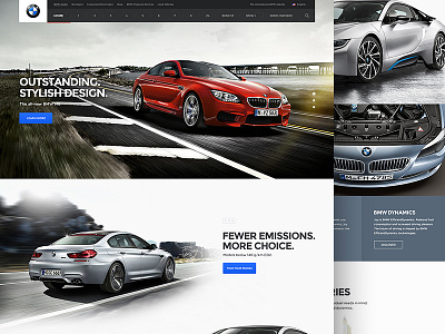
BMW Website Re-design
I recently navigated on the BMW's website and I was pretty disappointed with it. I was curious to see if the Dribbble community offers improvements and it does, but I couldn't find one that solves all the BMW's issues. So here's my take on Andrew Baygulov's re-design, as his design comes close to how BMW's website should be structured.
Press L and follow me!
Check out @2x and real pixels!
More by Georgian-Sorin Maxim View profile
Like

