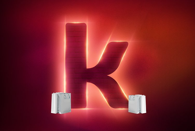
Kueski for Hot Sale - Campaign Key Visual
The concept of the campaign is based on having a presence in Hot Sale and being able to build elements of the brand for our clients, but also for those who are not yet Kueski users.
Similarly, continue building loyalty in the payment campaign of the future.
Combining these two main ideas, the elements of the campaign emerge. Kueski's K that is being illuminated by energy and light denoting that we are the payments of the future, in the background you can see the bricks used in the campaign and we see someone leaving with their purchases materializing from the energy of the user who already I make your purchase through our product.
The colors used refer to those used in the HotSale brand, however we use gradients that go from yellow to dark blue to continue taking it towards the graphic elements that we want to implement in Kueski's redesign to guide the gradual change as well as use auxiliary elements of the brand.
