ORE No. 001
OVERVIEW — Long time client, Runcible Cider Company, tasked me with the role of designing a label for their new, apple based, vermouth, ORE No. 001. Vermouth being a departure from their usual line of ciders, the primary objective was to create a label that would set this drink apart as a higher end offering.
The concept behind the name is a play on both the Oregon state abreviation as well as ore—the local rocks, metals, and minerals that contribute to the flavors of the ingredients contained within the drink. The number, 001, denotes the first installment in what may prove to be a broader series of drinks.
* * *
CREATIVE DIRECTION — Building on the themes underlying the name, the label was to be influenced by old topographic and geological maps. The beautiful array of colors and textures contained within these maps promised a label that would be both conceptually strong and visually stimulating.
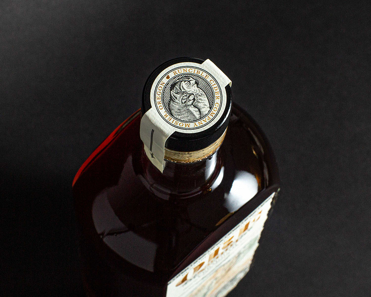
ILLUSTRATIONS — More than simply replicating a section of an existing geological map, we wanted to add a bit of artistic flair. So, we dipped into the archive and produced ornamentation and a seal in the tradition of old official certificates and documents. A reimagining of the two key figures in the primary Runcible Cider Co. identity, an owl and cat, were integrated into the seal as a subtle easter egg connecting this unique label to the broader Runcible Cider Co. brand.
The map was drawn from scratch hinting at elevation true to the region. In place of landmarks, ingredients and flavors contained within the drink were used to reinforce the regional nature of the drink’s composition.
LABELS — The front label was designed to appear as though it had been torn directly out of a map and applied to the front of the bottle. The back label played into the notion of a map key, with each of the drinks flavors being assigned a color found within the map on the front label.
Thanks again to Rob and Kelly at Runcible Cider Co.for allowing me the pleasure of bringing your vision to life.


